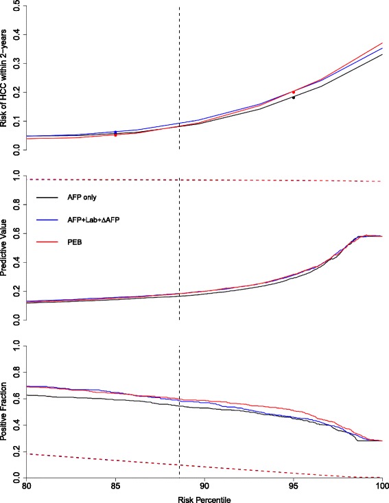
Fig. 3.

Comparison of screening algorithms within two years of clinical diagnosis (C1 in Fig. 2). In the top panel, we plot the estimated risk of HCC within two years for each screening approach against corresponding the risk percentile, which is defined to be the corresponding proportion of screens that lie below the threshold. The middle panel displays the positive predictive value (PPV(·,τ1=24,τ2=0), solid line) and the negative predictive value (NPV(·,τ1=24), dashed line) against the risk percentile and the bottom panel displays the patient-level true positive fraction (TPR(·,τ1=24,τ2=0), solid line) and the screening-level false positive fraction (FPR(·,τ1=24), dashed line) against the risk percentile. The vertical dashed lines in each plot correspond to the risk percentile associated with 10% screening-level FPR. The figures focus on curves between the 80th and 100th risk percentile. AFP+Lab+ ΔAFP: updated laboratory-based algorithm, PEB: parametric empirical Bayes algorithm applied to AFP
