Fig. 2.
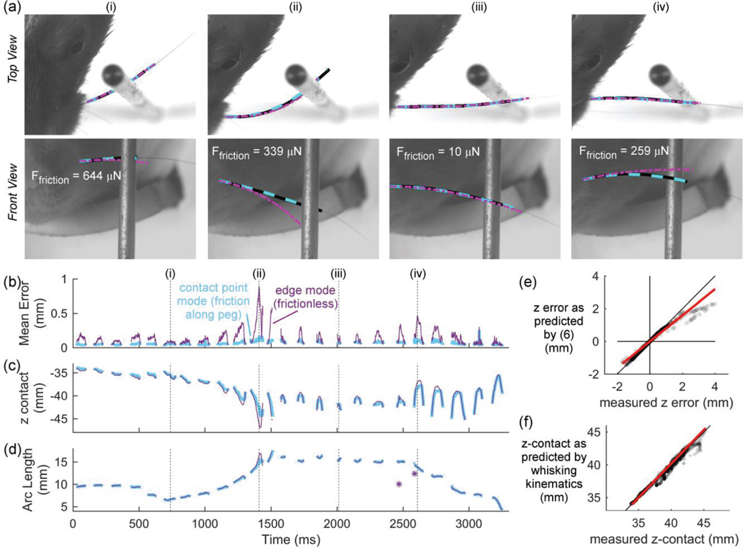
Friction affects the shape of the deflected whisker as the rat whisks against a peg. The four vertical dashed lines in (b), (c), and (d) mark the times shown in (a). (a) Top and front views of four video frames from a 3,300 msec trial of contact whisking behavior. The lines show the experimentally-tracked whisker (black), whisker shape predicted using contact-point mode (dashed cyan), and whisker predicted using edge mode (purple dashed-dot). Simulations using contact point mode accurately match the experimentally-tracked whisker in both camera views. The accuracy of this match is seen as a striped black-cyan line because the two traces overlie each other nearly exactly. In contrast, when the simulation is run using edge mode, the predicted whisker shape does not always accurately match the experimentally-tracked whisker. The match is particularly poor in frames (ii) and (iv). (b) The mean error between the experimentally-tracked whisker and the two modes of simulation. (c) The vertical location of contact simulated using contact-point mode and edge mode. Traces are color coded as in (b). (d) The arc length of contact (sapplied) with the peg predicted by the two modes of simulation. Traces are color coded as in (b). (e) Equation (6) offers a good prediction for zerror, the difference in contact point location when computed by edge mode and contact point mode. The dots are semi-transparent to show the data density. The best fit line is plotted in red, and the identity line is plotted in black. (f) In this figure, values on the x-axis show the vertical position of contact of the whisker on the peg as measured by the 3D video. Values on the y-axis represent the predicted vertical point of intersection between the peg and the whisker as computed only with whisking kinematics, with no information about the actual contact point. The dots are semi-transparent to show the data density. The best fit line is plotted in red, and the identity line is plotted in black.

