
Figure 6.
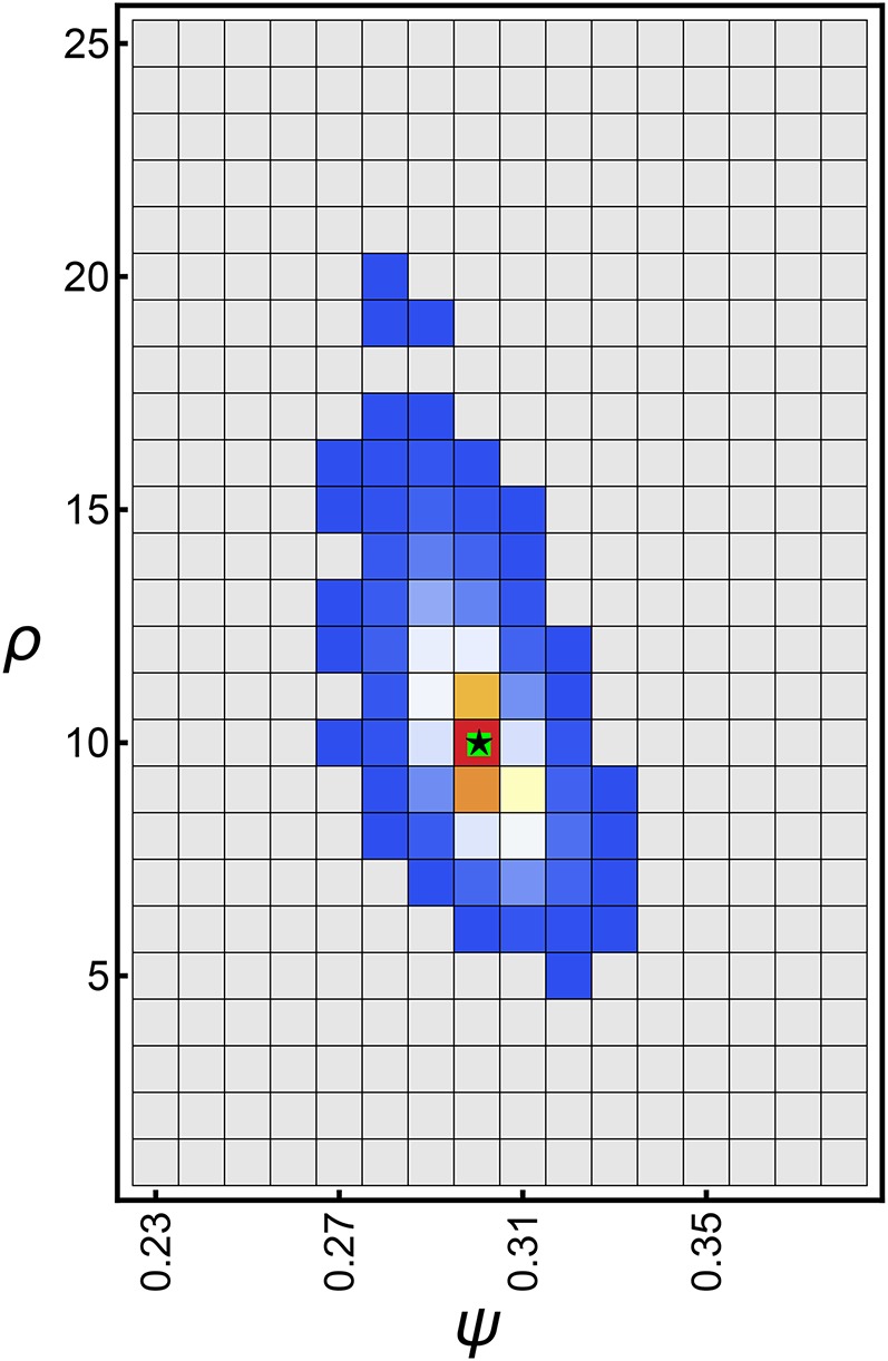
Heatplot of the frequency of the maximum likelihood estimates for whole-genome data sets assuming with and θ (Equation 45) with Counts increase from blue to red with gray squares showing zero counts. The green square shows the true ψ and ρ. The black star shows the median (and mean) of the maximum likelihood estimates and