Fig. 7.

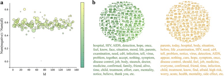
Figures in sentiment analysis. a The proportion of negative users in each community. The horizontal axis represents the community’s ID, the vertical axis represents the proportion of negative users in each community. Scatter size is proportional to the size of community and color corresponds to the ratio of negative users (green: low; yellow: high). b Popular keywords in different communities. Left: positive communities; right: negative communities (see Additional file 1: Table S5 for details)
