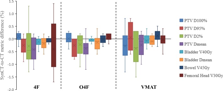
Fig 4. Box and whisker plot of differences in dose metric averages between synCT and CT plan for three treatment techniques.
A box showed 25th and 75th percentiles, the whisker indicated maximal and minimal values, the line inside a box indicates median, and the cross is mean of the differences in dose metric averages in the eleven patients.

