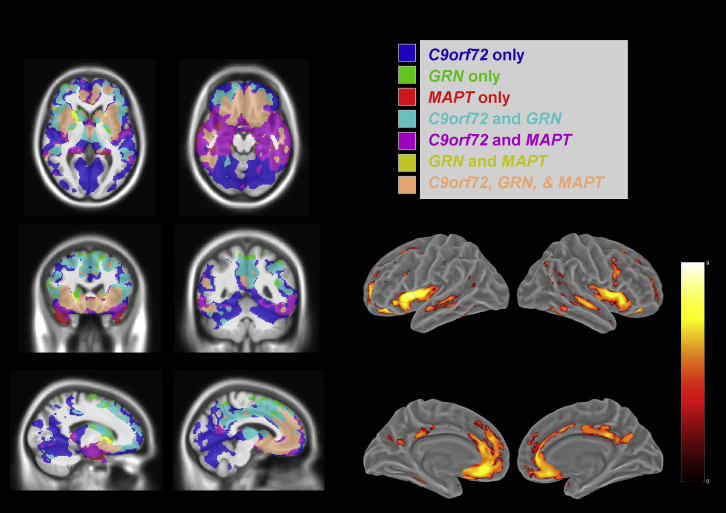
Fig. 2.
Comparison of gray matter atrophy patterns across the 3 genetic mutations. Comparison of atrophy patterns across the 3 genetic groups (symptomatic carriers). On the left hand of the figure, masks of the regions where there are significant differences (p < 0.05, FWE-corrected) are shown, color coded by mutation, along with areas where the patterns intersect within 2 or more mutations. The region satisfying the compound hypothesis of all 3 contrasts being true, indicating the intersection of atrophy in these mutations, is coded in light pink. A surface rendering of this intersection is shown on the right. (For interpretation of the references to color in this figure legend, the reader is referred to the Web version of this article.)

