Figure 2.
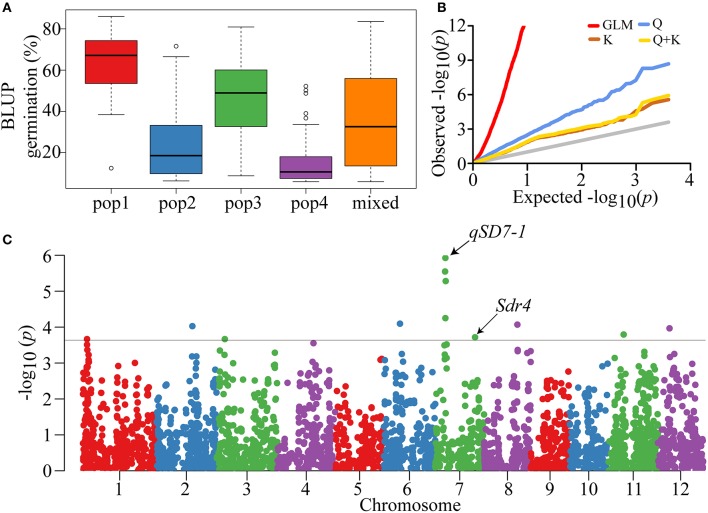
Phenotypic distribution and GWAS of seed dormancy. (A) Boxplot showing the differences in seed germination among five subpopulations of the indica-only panel. To reduce environment affect and simplify analysis, BLUP of seed germination of each subpopulation was used in the boxplot. Whiskers represent 1.5 times the quantile of the data. Individuals falling outside the range of the whiskers are shown as open dots. (B) Quantile-Quantile plots of GWAS results using different association models for all samples. Gray line represents the distribution of P-values assuming associations. (C) Manhattan plot showing P-values along the whole genome. The black straight line shows the threshold of P = 2.5E-04.

