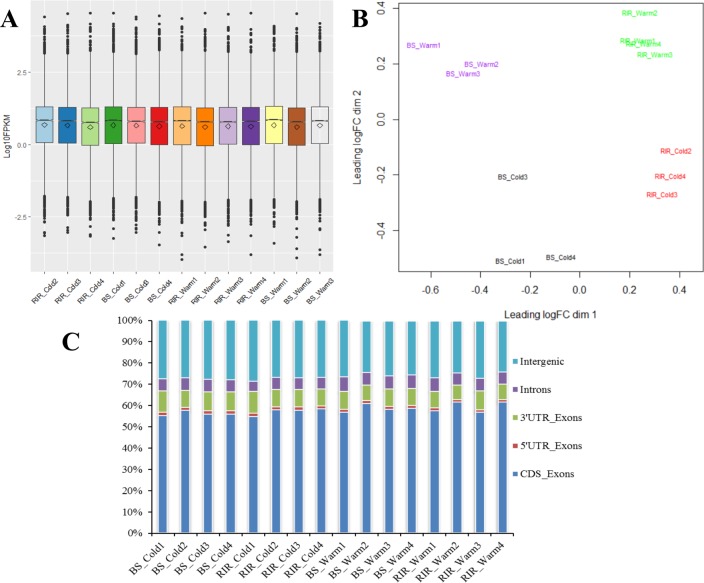
Fig 2. Gene expression patterns and mapped read distributions.
(A) Distributions of gene expression levels. Each box plot contains hinges at the 25th and 75th percentile, a line at the median, and a rhombus at the mean. (B) MDS plots showing the divergence between groups. (C) Distributions of the mapped reads.

