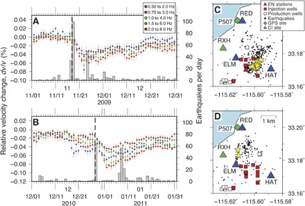
Fig. 3. Seismic velocity changes temporally correlated with earthquake swarms.

(A and B) Inferred seismic velocity changes in the time intervals (A) November to December 2009 and (B) December 2010 to January 2011. Gray bars represent the number of earthquakes per day that occurred within the regions shown in (C) and (D). Dashed lines indicate origin times of M 3+ earthquakes. (C and D) Map views of earthquake swarms. The blue triangles are the locations of the CalEnergy seismic network (EN network). Also shown are the locations of the geothermal injection (red squares) and production wells (white squares) obtained from the California Department of Conservation. Green triangle and diamond are the locations of seismic station RXH [Southern California Seismic (CI) Network] and continuous Global Positioning System (GPS) site P507, respectively. Black dots are relocated earthquake locations with a waveform cross-correlation analysis (77). Yellow stars are locations of M 3+ earthquakes. Earthquakes in the first 100 days from the first earthquake of the earthquake swarms were plotted.
