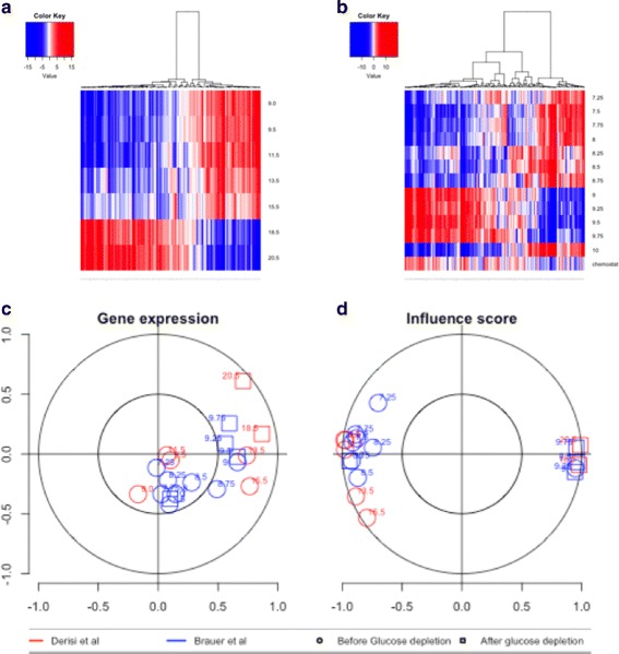
Fig. 5.

In a, heatmap for influences for the data set of Derisi et al., in b, heatmap for the dataset of Brauer et al. Positive influences are shown in red and correspond to an upregulation of targets, whereas negative influences are shown in blue and correspond to the downregulation of targets. At c, the correlation between samples based on gene expression is shown (calculated by canonical correlation analysis). At d, the equivalent correlation plot based on influence scores is shown. Samples obtained before and after glucose depletion can be clearly differentiated on the basis of influence scores, whereas the relationship is less clear for gene expression
