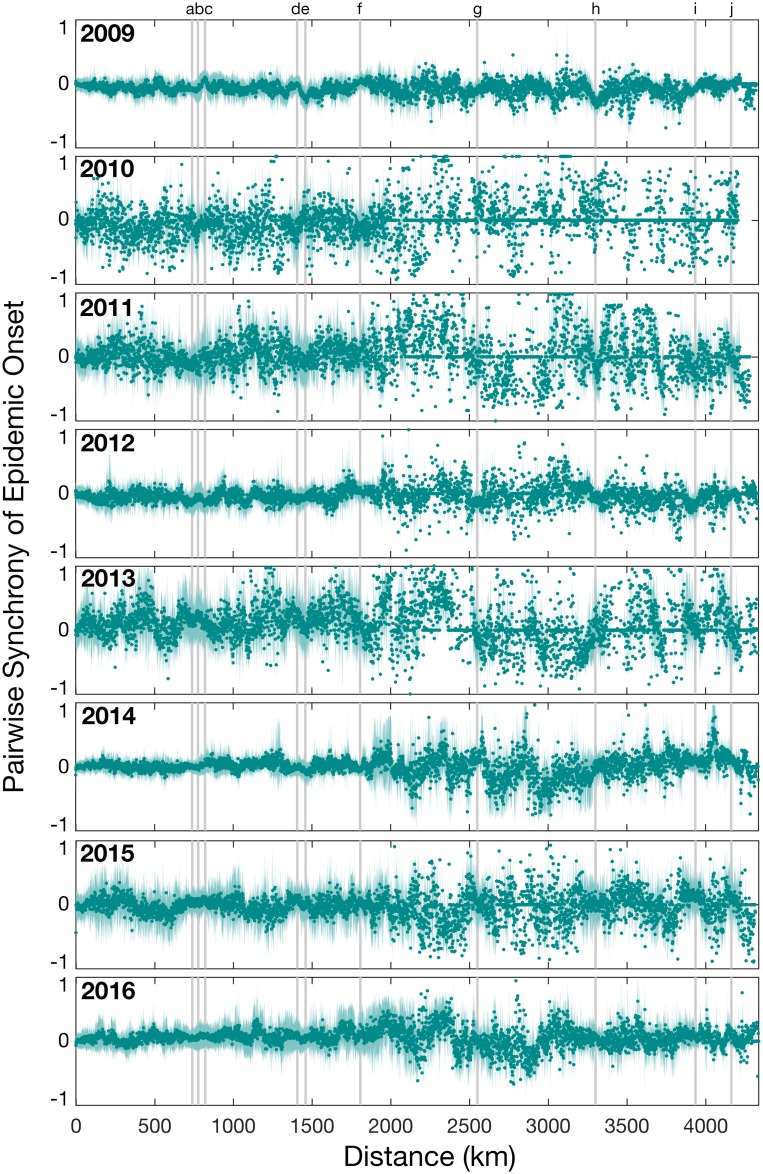
Fig 5. The normalized measure of pairwise synchrony in epidemic onset times between pairs of locations as a function of distance (kilometers).
Values near zero indicate that epidemics start close together in time, while values near -1 and 1 indicate a lag in onset times. Each circle illustrates the mean pairwise synchrony for pairs within 1 kilometer and the shaded area represents the 95% percentile for the mean. Only years 2009–2016 are shown since these years had larger and more consistent sampling across all locations. Grey vertical bars mark the pairwise distances between the major cities: Sydney, Melbourne, Brisbane, Adelaide and Perth, in the order shown in S1 Table.

