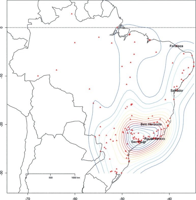
Figure 1.
Cities with units using the Epimed Monitor in Brazil. A 2D stat density plot is overlaid on the map. The density plot provides a visual representation of the distribution of data over a continuous interval. (Therefore, it is a variation of a histogram using kernel smoothing.) In this figure, the density plot is presented in two dimensions according to the latitude and longitude of the participating intensive care units.

