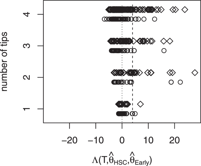
Fig. 3.

Each circle represents a tree TEarlyMPP from EarlyMPP, each diamond represents a tree THSC from HSC. The x-axis displays seperated by the size of the tree via the y-axis. To the right of the dotted line are trees for which fits better than to the right of the dashed line are trees for which fits significantly better than .
