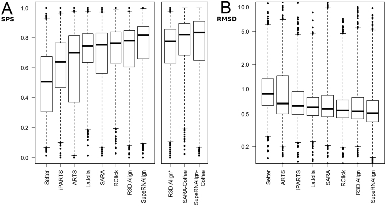
Figure 3.
A comparison of the accuracy of benchmarked methods. These boxplots show the distribution of scores (A, sum-of-pairs; B, RMSD (in Å, shown in logarithmic scale) obtained by the RNA superposition methods. Boxes mark quartiles (Q1, median, Q3); whiskers stretch from 1st to 99th percentile; outliers are shown as dots.

