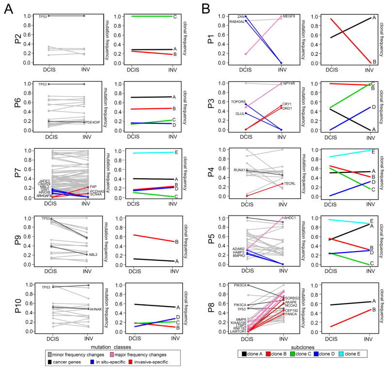
Figure 7. Mutation Frequencies and Clonal Dynamics During Invasion.
Purity adjusted mutation frequencies and clonal subpopulations and frequencies inferred from exome data. (A) Patients with minor changes in mutation and clonal frequencies. (B) Patients with large mutation or clonal frequency changes during invasion. The left panels show purity-adjusted nonsynonymous mutation frequencies for the in situ and invasive regions. Lines in grey indicate mutations with minor frequency changes, while lines in pink show large frequency changes (>0.5) between the in situ and invasive regions. Mutations in dark grey indicate driver mutations, while mutations in blue are in-situ and red are invasive-specific. Right panels indicate clonal subpopulations and frequencies inferred by PyClone2 and CITUP, with lines indicating different clonal subpopulations.

