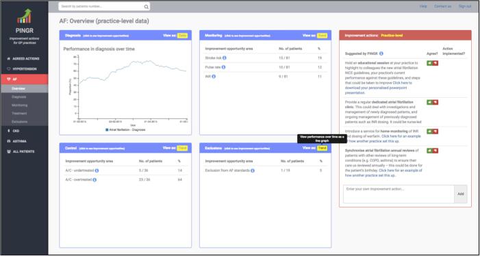
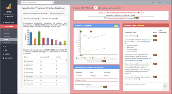
Fig. 1.
The Performance Improvement plaN GeneratoR. Overview level interface (top) displaying clinical performance summaries (light blue border boxes at the centre of the screen, where each box represents a care pathway: diagnosis, monitoring, control and exclusions) and organisation-level suggested actions (light red border box, right-hand side of the screen). Preview level interface (bottom) displaying the improvement opportunities bar chart, patient lists, detailed patient-level data and suggested actions. The background colour of the detailed patient-level data interface component turns red when an improvement opportunity is present. AF = atrial fibrillation; A/C = anticoagulation; BP = blood pressure; DASH = Dietary Approaches to Stop Hypertension; NICE = National Institute for Health and Care Excellence; OD = Once daily; QOF = Quality and Outcomes Framework. (For interpretation of the references to colour in this figure legend, the reader is referred to the web version of this article.)


