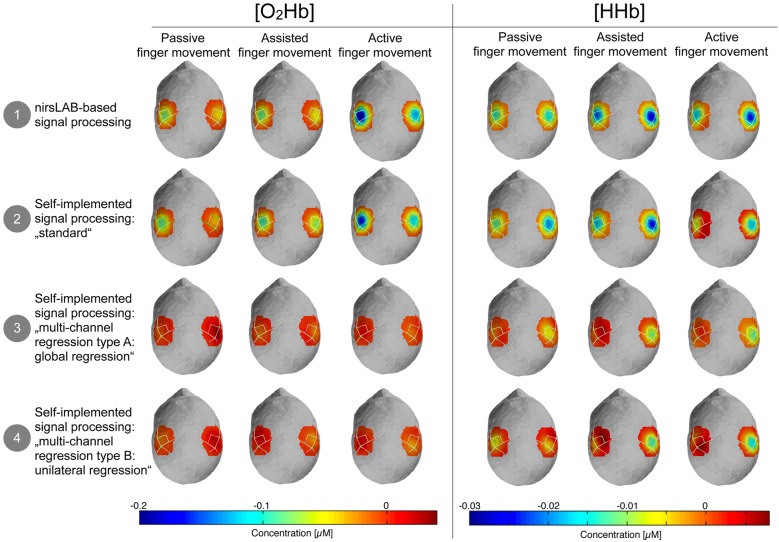
Figure 5.
Topographic maps of the relative changes in amplitude of [O2Hb] and [HHb] compared to baseline. Blue areas represent channels where the amplitude was lower compared to baseline and dark red channels represent channels where the amplitude was larger compared to baseline. Please note that orange-red areas indicate no change compared to baseline.

