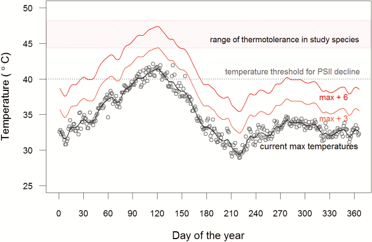
Figure 5.
Maximum daily air temperatures in the region—data from Pune, India (2005–14). Absolute daily maximum temperatures are shown by the open circles, and the black line represents a smoothed curve fitted to this data (current max). We estimate future maximum temperatures by adding 3–6 °C to current maximum temperatures (Malhi et al. 2014)—this represents lower and upper predictions for the increase in temperatures in tropical regions by the end of the century (max + 3—orange line; max + 6—red line). The red hatched area highlights the range of thermotolerance observed in the studied species, and the grey dashed line represents the temperature above which we observed a significant decline in PSII function. Daily air temperature data were obtained from GHCN (Global Historical Climatology Network) daily Version 3.22.

