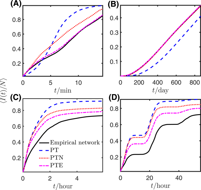
Figure 4.
Mean prevalence evolution on empirical networks and the corresponding reference models. Each panel shows the mean fraction of infected nodes, 〈I(t)/N〉, at each point in time for the original contact sequence (black solid line) and the PT, PTN, and PTE reference models (each averaged over four reference networks). (A) Ant, (B) Prostitution, (C) Conference, and (D) Workplace. In panel (B), the prevalence curves for the empirical network and the PTN and PTE models are so close as to be indistinguishable.

