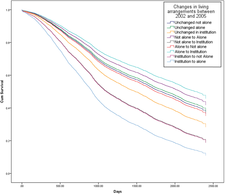
Fig. 2.
Survival curves from 2005 to 2011, by changes in living arrangements between 2002 and 2005 (whole sample) (Note: the lines for elderly people who moved from “not alone to institution” and from “institution to not alone” overlap in this figure and are shown by the second line from the bottom).

