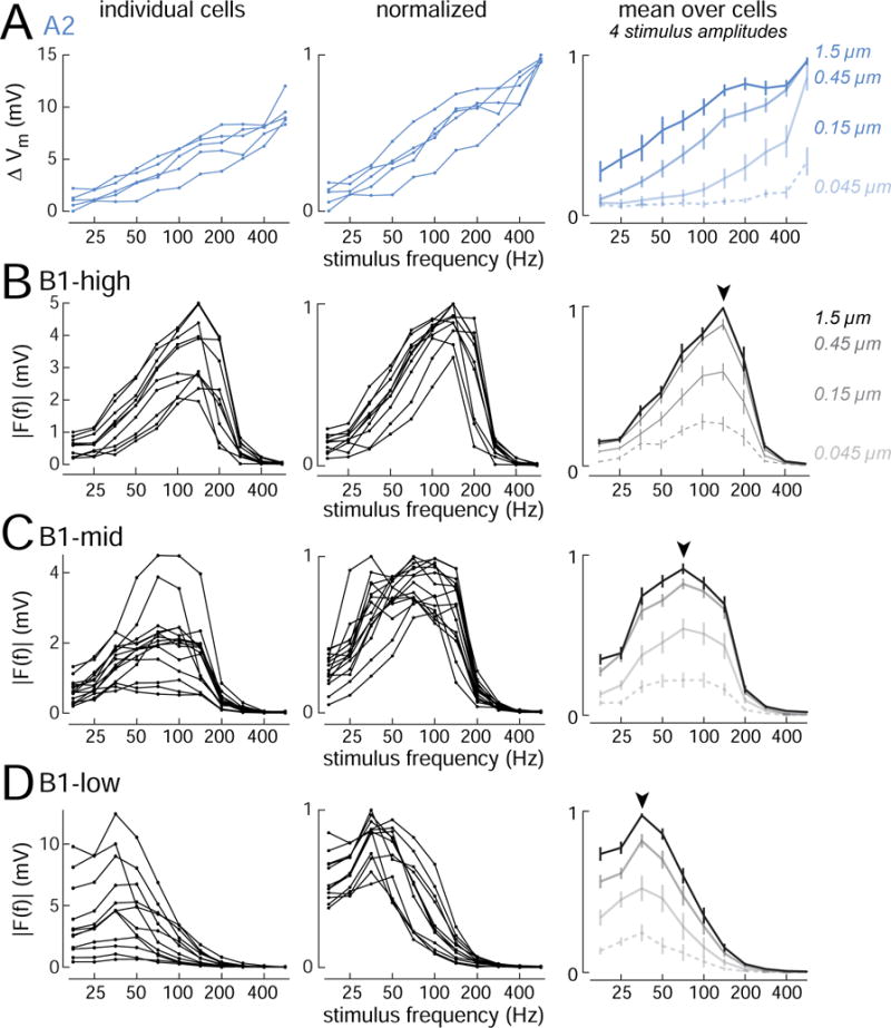
Figure 2. Diverse vibration frequency tuning.

(A) Frequency tuning curves for A2 cells (n=5 cells; stimulus amplitude is 0.45 μm). Response magnitude is calculated as the change in average voltage during the 300 ms stimulus presentation, which is strongly correlated with A2 cell spike rate (Figure S1). Right panel shows cell-averaged responses to four stimulus amplitudes (± SEM across cells). X-axes are logarithmic to emphasize differences in tuning at lower amplitudes.
(B) Same but for B1-high cells (n=10 cells). For all B1 cells, response magnitude is calculated as the amplitude of the Fourier component of the response at the stimulus frequency. Arrowhead indicates modal best frequency.
(C) Same but for B1-mid cells (n=15 cells).
(D) Same but for B1-low cells (n=12 cells). Figure S3 shows the same data sorted by Gal4 line.
