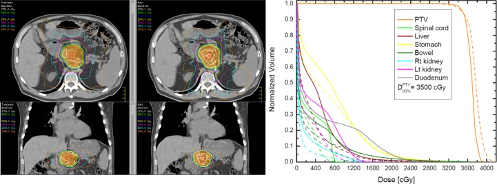
Fig 2. Comparison of isodose plots (left) and DVHs between a manually planned treatment and an auto-optimized plan.
The left column displays the absolute doses of the treatment plan on axial and coronal views, while the right column corresponds displays the auto-plan for the same patient. The colorwash structure is the PTV, while the green isodose line is the prescription dose of 35 Gy. The DVH plot on the right outlines the treatment DVHs (solid lines) and the auto-optimized DVHs (dashed lines).

