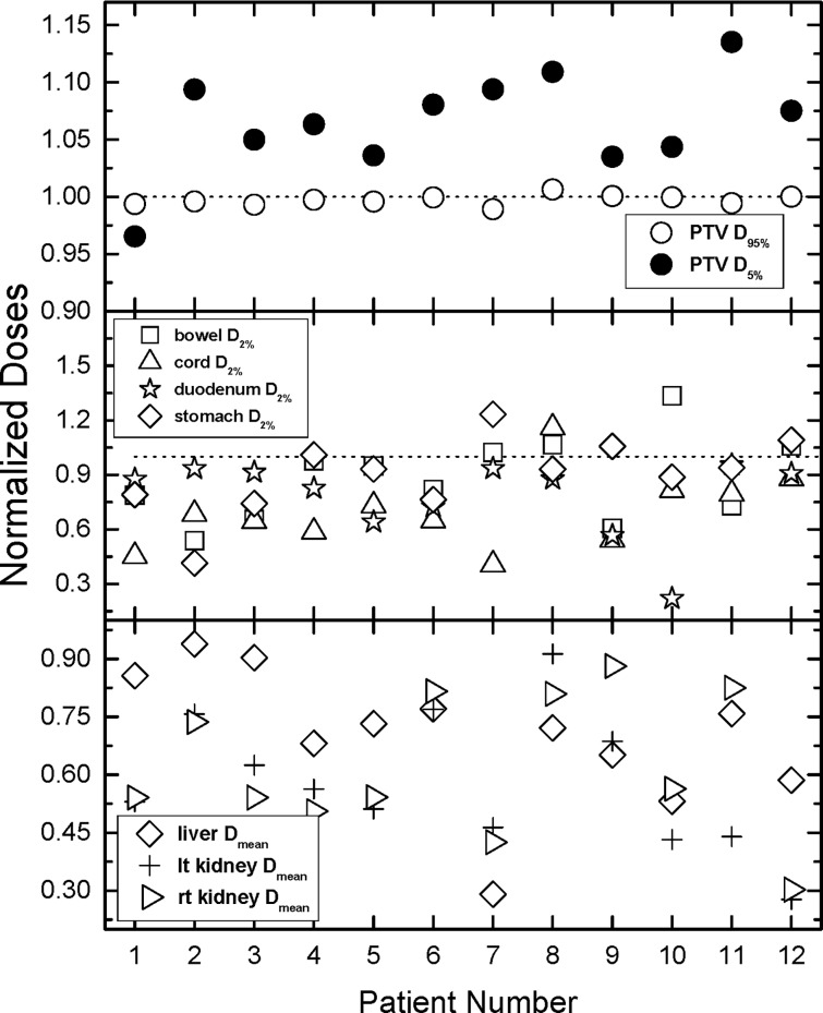
Fig 3. Comparison of all normalized tallied indices.
Normalization is performed with respect to the doses derived from the treatment plans and plotted as a ratio of auto-plan over manual treatment plan. Values greater than one indicate more dose for the auto-plan compared to the manual plan, values less than one indicate less dose for the auto-plan, and values equal to one indicate equal doses for the two compared plans. The top panel outlines the normalized doses to 95% and 5% of the PTV. The middle panel contains the data for doses to 2% of duodenum, bowel, stomach, and spinal cord. 2% of the volume for those OARs have been used as surrogates for maximum doses. The bottom panel of the figure outlines the average doses to liver and kidneys. Note that while most normalized maximum doses in the middle panel are smaller (majority) than unity, all normalized mean doses in the bottom panel which are smaller than unity.

