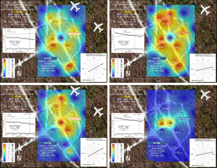
Fig 5. Efficacy maps of 12 hr interpolated mortality data.
These maps represent spray efficacy for (A) indoor unprotected (“outside boxes”) and (B) outdoor protected (“inside boxes”) sentinel cage locations at Village on (left) 29 October (8001 nozzles) and (right) 30 October (8003 nozzles). These interpolated “heat maps” show a range of mortality from very low (blues and light greens) to very high (oranges and reds). The aircraft silhouette symbol shows the actual size, position, and flightpath of the first upwind swath of the C-130H relative to the map scale. Additional efficacy maps of interpolated mortality data for all sentinel cage locations in all trials are shown in Figure Sets A–D in S1 Fig. Maps were created using ArcGIS software by Esri under license as described in S2 File.

