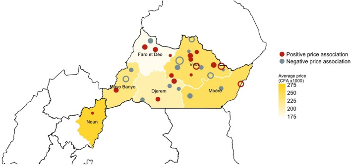
Figure 4.
Geographical distribution of the markets and their estimated effect on the price of the traded cattle across the study area. Red color relates to markets with a positive association on price of live cattle, while gray color relates to markets which a negative association on price of live cattle. The size of the dots is proportional to the mean impact on price of the market over the 50 iterations: the bigger the dot the bigger the effect on the price. Open circles refer to the market that have a consistent, either positive or negative, effect on price across the 50 iterations. The intensity of the yellow background color, instead, relates to the mean price of animals traded in each division within the study area.

