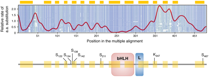
Figure 7.
Aminode example: Analysis of transcription factor EB (TFEB). Upper panel, Aminode graphical output. The red line represents the relative rate of amino acid substitution calculated at each protein position. Local minima (highlighted by yellow bars above the graph) are constrained regions with relatively low substitution rates. Peaks (local maxima) indicate regions with relatively high substitution rates. The amino acid sequences for each ortholog are shown in shades of blue to green (more conserved to less conserved) in the background of the graph. Lower panel, Schematic of TFEB protein structure showing the position of the DNA-binding bHLH domain, the leucine zipper domain (L) and various known sites of post-translational modification that regulate TFEB function (references in the text).

