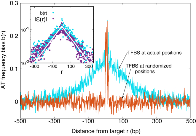
Figure 3.
AT frequency bias b(r) (5) as a function of distance r from the target. The curve labeled TFBS at actual position displays b(r) computed over the whole set of 1544 unique target sequences in the DB (see ‘Materials and Methods’ section). The other curve represents the same quantity computed with TFBS at randomized positions (as labeled) on the DNA. The randomized computation is performed as in Figure 2. Inset: comparison between  and b(r), as in the legend, in linear-log scale. The white thick lines are an exponential fit aexp ( − |r|/ℓf), yielding ℓf ≈ 120 bp and a ≈ 0.128.

