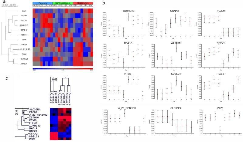
Figure 4.
Heat maps and clustering of responsive genes and samples. (a) Clustering of the 12 genes with change in mean expression following dosing. Cosine correlation dissimilarity with Ward clustering was used. The log base 2 gene expression ratio data (subject to reference) for subjects within each class at a given day were averaged and then each profile was standardized such that the distribution across the days has a mean equal to 0 and standard deviation of 1. The days relative to the initial dosing are denoted. The heat map color bar represents the relative gene expression: red is up-regulated, blue is down-regulated. (b) Plot of the gene expression data by day for the 12 early responsive genes. The x-axis is the day relative to the initial day of dosing. The y-axis is the least square (LS) mean of the log base 2 ratio data (subject to reference). The error bars represent the standard error of the mean. (c) Two-dimensional clustering of the 12 genes and subjects overdosed on acetaminophen or controls. Cosine correlation dissimilarity with average linkage clustering was used. Log base 2 ratio data (reference to subject) is represented by color: red is up-regulated, blue is down-regulated.

