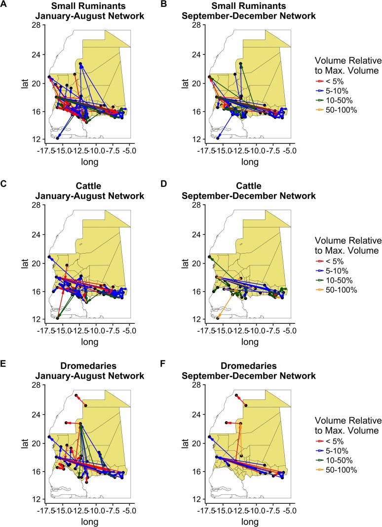
Fig 8. Mobility network along the year according to the species.
Each line corresponds to the network specific to a species. Left column, network during the first period. Right column, network around Tabaski period. Color indicates the volume moved along the connection, normalized to the maximum volume for the period of the year. Maps done using R version 3.3.1 (https://www.r-project.org).

