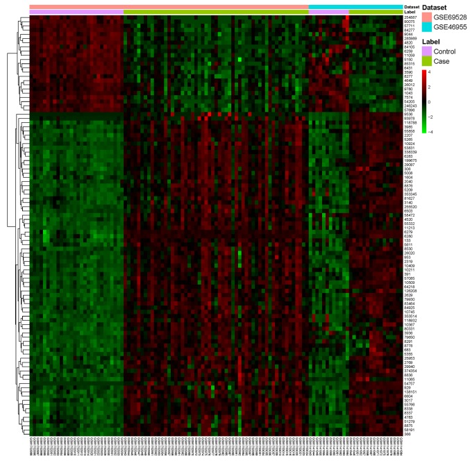
Figure 1.
Heatmap of the top 100 DEGs. The diagram represents the result of a two-way hierarchical clustering of the top 100 DEGs and samples. The clustering was constructed using the complete-linkage method in combination with the Euclidean distance. Each row represents a DEG and each column represents a sample. The DEG clustering tree is presented on the left. The color scale illustrates the relative level of DEG expression: Red, lower than the reference expression; green, higher than the reference expression. DEG, differentially expressed gene.

