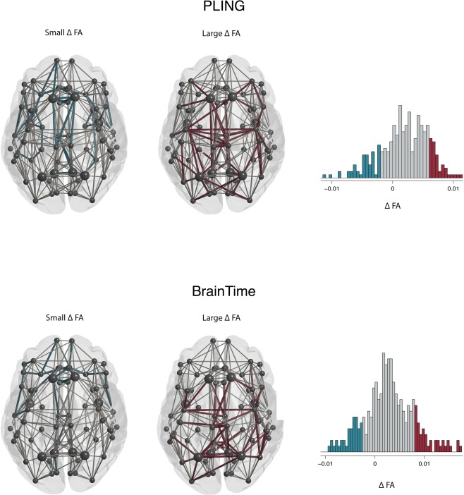
Figure 2.

Connected components of largest (red) and smallest changes (blue) in FA frontal lobe at the top of the image. The PLING dataset is represented in the top row and the BrainTime dataset in the bottom row. Nodes (circles) and edges (lines) are displayed for the reconstructed thresholded group averaged brain networks. The histogram shows values for all edges in the group network. Edges that showed an age‐related change of 1 SD smaller than the mean change in FA are displayed in blue (small FA). Connections larger than 1 above mean change in FA are displayed in red (large FA). The largest two connected components were selected for both sets of edges. Rich‐club nodes are represented by large circles. [Color figure can be viewed at http://wileyonlinelibrary.com]
