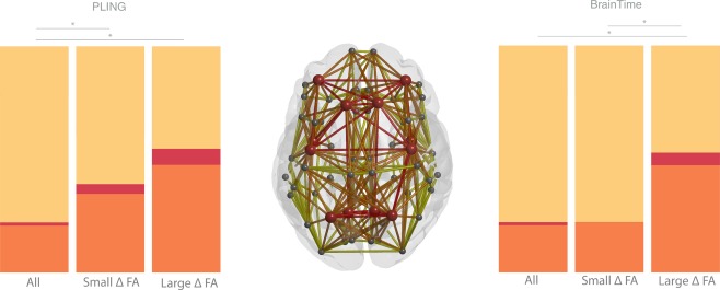
Figure 3.

Percentage of anatomical distribution of rich club, feeder, and local edges in red, orange, and yellow, respectively. The middle graph shows a schematic representation of the group averaged reconstructed brain network. Nodes (circles) represent brain regions where rich club nodes are indicated by red circles. The bar graphs on the left (PLING set) and right (BrainTime set) indicate that a larger proportion of feeder and hub edges and a smaller proportion of peripheral edges were observed in the edges showing large age‐related changes in FA (large FA) compared to the distribution of edges showing the smallest change in FA (small FA) and compared to the distribution of edge categories for all possible edges. [Color figure can be viewed at http://wileyonlinelibrary.com]
