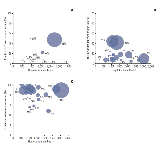
Fig. 1.

Bubble charts for the proportion of patients by the hospital. Two-dimensional bubble charts indicate how the proportions of adjuvant chemoradiotherapy (A), neoadjuvant chemotherapy (B), and adjuvant chemotherapy use (C) in each hospital change by hospital volume. The size of the bubble corresponds to the proportion within each treatment group. RT, radiotherapy.
