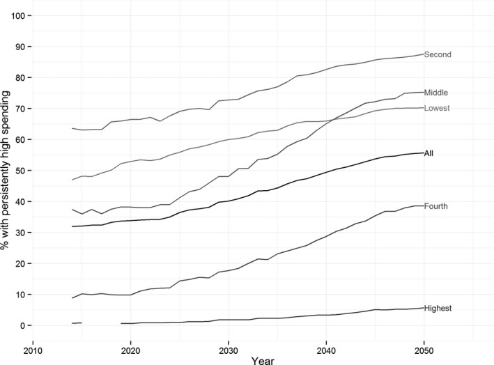
Figure 3.

Time Trends in Persistently High Health Care Spending
Note. The lines show the percentage of people in the simulated population who spend at least 20 percent of per capita income on health care (in the index year ± 2 years) in each year of the simulation. Results are shown separately for each income quintile and for the whole population. These results come from the baseline simulation scenario.
