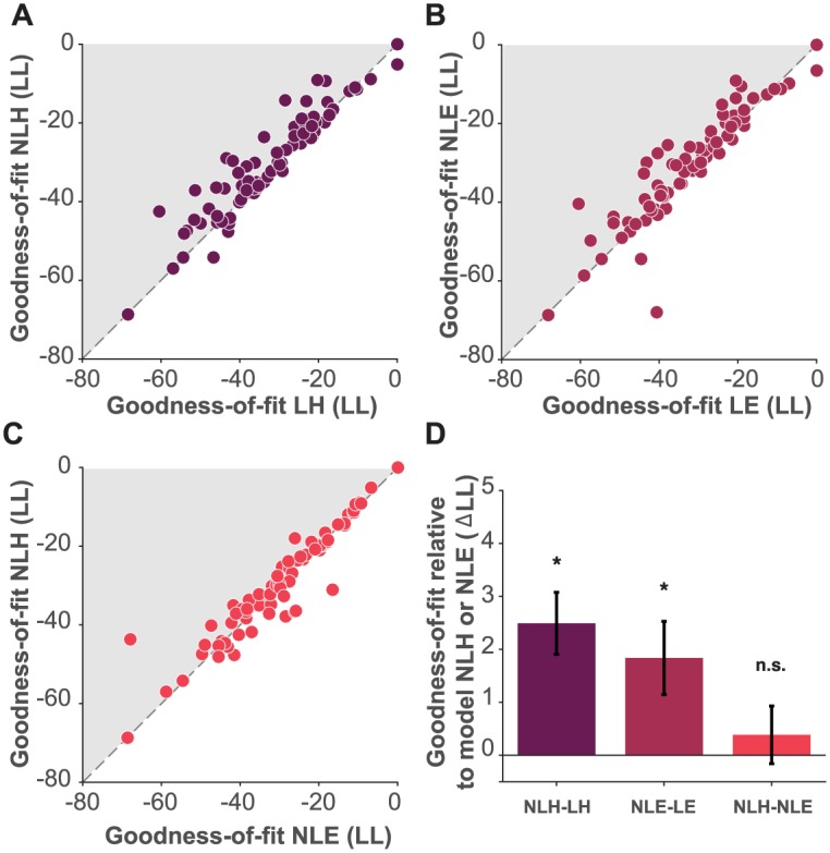
Fig 2. Model comparison.

A: cross-validated log likelihood (LL) comparison of model LH against model NLH. Each dot corresponds to data from a single subject’s session. B: LL comparison of model LE against model NLE. Panel C, LL comparison of model NLE against model NLH. Shaded areas for panels A and B correspond to sessions for which the nonlinear utility models fit the data better than the linear utility models. C: Shaded area corresponds to sessions for which the NLH model fit the data better than the NLE model. D: average difference in LL across all sessions between model NLH and model LH (dark color), between model NLE and model LE (intermediate color) and, between model NLH and model NLE (light color), black bars indicate S.E.M.
