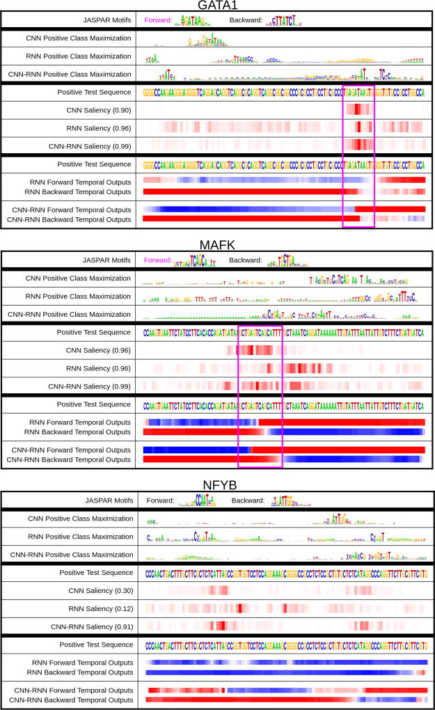
Figure 2. DeMo Dashboard.
Dashboard examples for GATA1, MAFK, and NFYB positive TFBS Sequences. The top section of the dashboard contains the Class Optimization (which does not pertain to a specific test sequence, but rather the class in general). The middle section contains the Saliency Maps for a specific positive test sequence, and the bottom section contains the temporal Output Scores for the same positive test sequence used in the saliency map. The very top contains known JASPAR motifs, which are highlighted by pink boxes in the test sequences if they contain motifs.

