. 2018 Jan 29;7:e31097. doi: 10.7554/eLife.31097

Figure 1. Overview of integrative pathway mapping method.

The four stages of integrative modeling are: (1) Gathering information, (2) Designing model representation and evaluation, (3) Sampling good models, and (4) Analyzing models and information. (1) Here, the input information is gathered from seven different sources used to determine the candidate proteins, such as co-localization and conservation in the genome neighborhood, and the scoring restraints (docking scores from virtual screening, chemical transformations, ensemble similarity calculations of virtual screening hits from similarity ensemble approach, DSF screening hits, metabolic endpoints, and characterized chemical reactions). (2) A pathway model is represented as a graph composed of protein and ligand nodes. Proteins are depicted as diamonds and ligands are depicted as circles, with lines showing the node patterns evaluated by a given type of information. (3) The combinatorial optimization problem is solved by Monte Carlo simulated annealing sampling, consisting of randomly swapping nodes in and out of the pathway model and rearranging the edges between the nodes. (4) The final analysis stage involves assessing the sampling, precision, and accuracy of the models.

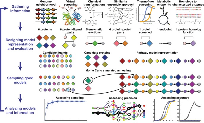
Figure 1.

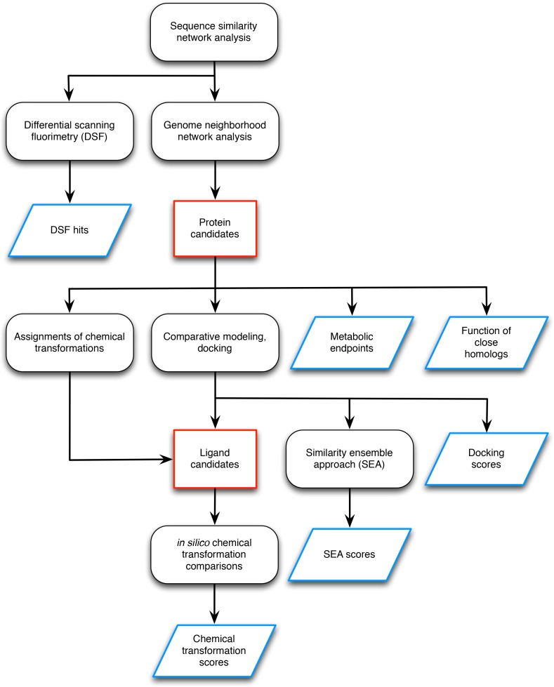
Figure 1—figure supplement 1. Workflow for preparing input data for the L-gulonate catabolic pathway prediction.

Figure 1—figure supplement 1.

The preparation of the input data entails identification of the candidate proteins and candidate ligands (outlined in red) and the generation of information to be used as scoring restraints (outlined in blue). The initial step was sequence analysis of the TRAP solute binding proteins, and target proteins were identified for follow-up screening by DSF and genome neighborhood analysis (Uniprot ID P71336 and Uniprot ID A7JQX0). Analysis of the genome neighborhood network led to the selection of possible pathway proteins. In this case, the candidate proteins were hypothesized to be involved in sugar catabolism, so metabolic endpoints were selected from intermediates in central metabolism mapped in the KEGG database. The functions of close homologs (>70% sequence identity) were identified, which in this case, included D-mannonate dehydratase. Chemical transformation patterns were inferred by the Pfam annotations of each of the candidate proteins. Structural models of the candidate proteins were created by comparative modeling, and metabolite docking of a large screening library against each of these models was performed. The chemical structures of the metabolites with the top docking scores were compared chemoinformatically to produce SEA scores. With the chemical transformations and docking scores, the metabolite library was filtered down to a smaller set of candidate ligands. For every candidate ligand, each chemical transformation was applied in silico, and the results were compared chemoinformatically with every other candidate ligand to produce chemical transformation scores. This workflow resulted in the following sources of information to be used in scoring: DSF hits, metabolic endpoints, functions of close homologs, docking scores, SEA scores, and chemical transformation scores.
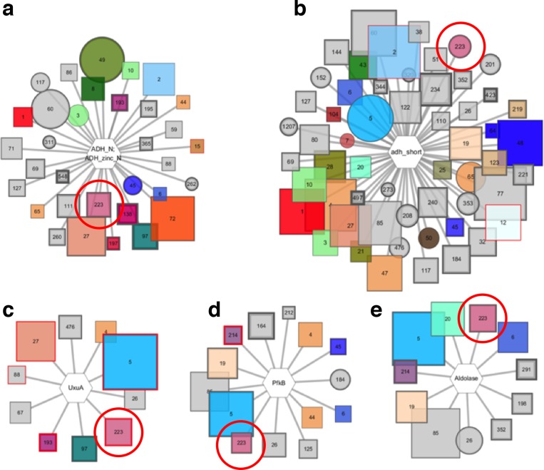
Figure 1—figure supplement 2. Pfam genome neighborhood network (GNN).

Figure 1—figure supplement 2.

Five enzyme families are extracted from the Pfam GNN, they are identified by cluster 223 in the SSN indicated by red circles. The Pfam families include; (A) alcohol dehydrogenases, (B) short chain dehydrogenases, (C) UxuA family sugar dehydratases, (D) pfkB family carbohydrate kinases, and (E) aldolases.
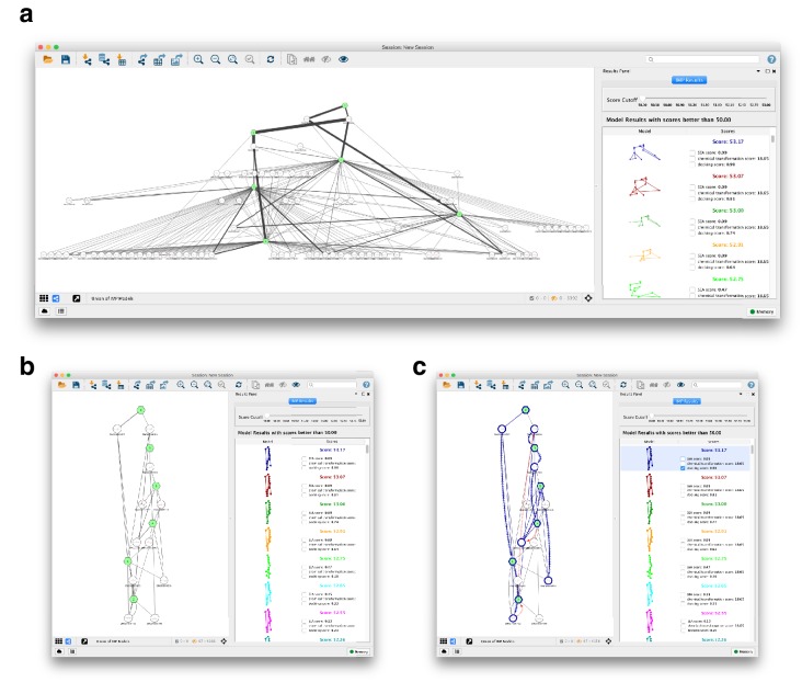
Figure 1—figure supplement 3. NetIMP cytoscape application for pathway model visualization.

Figure 1—figure supplement 3.

(A) Cytoscape app loads in good-scoring pathway models and displays them as a network built from the union of edges present in the ensemble of models. The automated yFiles hierarchic layout was applied to the network. The thickness of the edge represents the frequency that the edge appears in the ensemble. (B) The slider in the Results Panel can adjust the score cutoff for the models included in the network. In this view, the automated yFiles hierarchic layout is reapplied and singleton nodes are hidden for clarity. (C) An individual model is selected in the Results Panel, and the nodes and edges in the individual model are highlighted in the model’s unique color (in blue, here) on the network. The restraints are represented by the hatched edges connecting nodes corresponding to the restraints. Restraints that are violated in the mode are colored red.