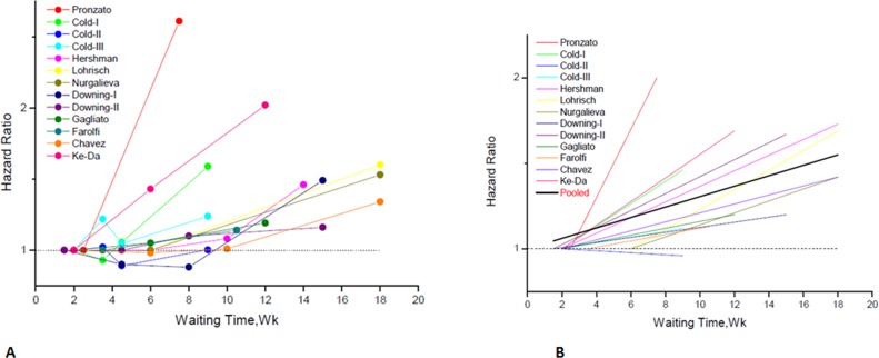
Figure 2. Individual hazard ratio for overall survival according to waiting time categories.
(A) The relationship between waiting time categories and overall survival in the 12 independent analytical groups. The hazard ratio (HR) represents a comparison with the first waiting time category in each study (as reference). The first author of each study is shown. (B) Conversion of HR estimates from the original studies to an HR per week of delay. The slope of each line represents the change in the log HR per week of delay. The line for each individual study is located over the range of waiting times. The thick line indicates the weighted average of the HRs from the individual studies. The vertical axis is on a log scale.

