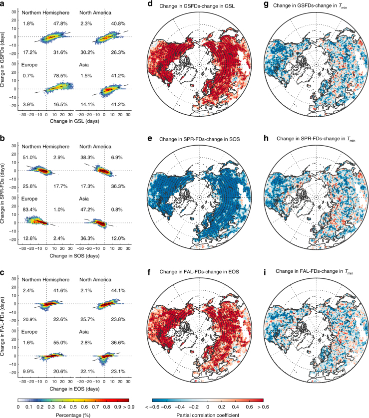
Fig. 3.
Relationship between the changes in phenology and corresponding frost days. This relationship is presented between the 1980s and the 2000s at both continental and local scales. The number of frost days was averaged from the results of the Princeton and WFDEI data sets. The colors in the left panels (a–c heating plots with percentage of pixels in each quadrant, continental scale) indicate the proportions of pixels that fall within each binned area (i.e., every 1 day in the changes of the number of frost days and phenology) in the Northern Hemisphere. The center (d–f) and right (g–i) panels display the spatial partial correlations between changes in the number of frost days with phenology and Tmin, respectively, using a moving window of 2.5 × 2.5° (i.e., local scale). Dotted regions indicate the correlations that were significant at P < 0.05, t-test. Maps were created using Matlab R2014b

