

Abstract
The Web Redesign Committee at the Health Sciences and Human Services Library (HS/HSL) of the University of Maryland was formed to evaluate its site and oversee the site's redesign. The committee's goal was to design a site that would be functional, be usable, and provide the library with a more current image. Based on a literature review and discussions with colleagues, a usability study was conducted to gain a better understanding of how the Website was used. Volunteers from across the campus participated in the study. A Web-based survey was also used to gather feedback. To complement user input, library staff were asked to review the existing site. A prototype site was developed incorporating suggestions obtained from the evaluation mechanisms. The usability study was particularly useful because it identified problem areas, including terminology, which would have been overlooked by library staff. A second usability study was conducted to refine the prototype. The new site was launched in the spring of 2000. The usability studies were valuable mechanisms in designing the site. Users felt invested in the project, and the committee received valuable feedback. This process led to an improved Website and higher visibility for the library on campus.
INTRODUCTION
Creating a quality Website involves planning and considering several key design elements carefully. Visual appearance, although important, is only one aspect of design. The utility of the site (how well it functions) and its usability (how effectively users can navigate it) are also key factors [1]. Gullikson et al. quote Jakob Nielsen, an expert in Web usability, who has determined that “people do not come to the Web for an ‘experience,’ they come for information” [2]. This is especially true of people using library Websites, where finding reliable information quickly and easily is essential.
The Health Sciences and Human Services Library (HS/HSL) of the University of Maryland, Baltimore, serves the faculty, staff, and students of six schools including the Dental School, Graduate School, School of Medicine, School of Nursing, School of Pharmacy, and School of Social Work. It also serves the University of Maryland Medical System. The library's original Website (Figure 1) was developed in 1996. Although changes were made over the next three years to enhance the site, it became apparent through informal observations and comments from staff and library patrons that the time had come for the site to be completely restructured. Several problems were identified. The site was too heavily text based. Also, the resources available through the site were limited to databases, the HS/HSL online catalog, and basic information about the library and its services. There were too few compilations of Web resources by topic. The organization of the site was confusing. Users had difficulty locating some important information, because it was not on the main page. Navigation was cumbersome, requiring too much scrolling. An additional factor that influenced the decision to redesign the site was the library needed to have an updated look to complement its new building, which had opened the previous year.
Figure 1.
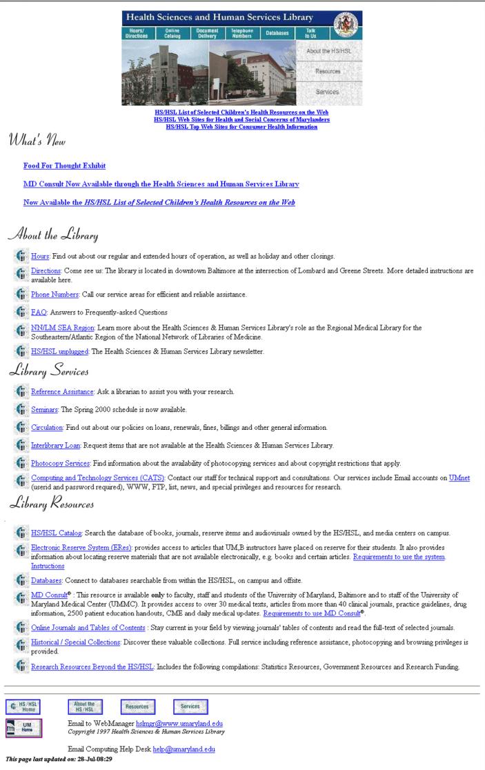
The library's original Website
The Web Redesign Committee was formed to review and restructure the HS/HSL Website in the fall of 1999. A key element in the redesign would be the collaboration among various operating divisions in the library. Staff from Access Services, Computing and Technology Services, Information and Instructional Services, Library Administration, and Resources Management served on the committee. The Internet coordinator for the Southeastern/Atlantic Region of the National Network of Libraries of Medicine also participated. Input from the nine-member committee would be balanced with user feedback.
The committee began its review by identifying the goals of the HS/HSL Website, reviewing general guidelines for Web design, and evaluating selected Websites. The goals consisted of: (1) providing access to information resources and services to meet the research, educational, and clinical needs of the faculty, staff, and students of the University of Maryland, Baltimore; (2) serving as a major conduit for the dissemination of news and information about the HS/HSL; and (3) establishing links to health care resources of interest to consumers.
The committee reviewed Nielsen's articles on the “Ten Good Deeds in Web Design” [3], “Top Ten Mistakes of Web Design” [4], and the “Top Ten New Mistakes of Web Design” [5], which provided points to consider in designing a site. Seven academic library sites and the National Library of Medicine's Website (Appendix A) were also reviewed to give committee members a feel for design layouts and features. Some of these Websites included the use of “quick links” (University of Michigan), creative use of graphics (University of Arizona and Thomas Jefferson University), use of icons to indicate access to resources (University of Washington), consistent use of toolbars (University of Southern California), use of pop-up menus to eliminate scrolling (University of Arizona), and good use of color in a text-based design (National Library of Medicine). Library staff were encouraged to share additional sites (not restricted to library sites) that they thought were designed well or contained useful features. Although knowing what the committee liked and disliked was important, discovering what users thought was more important.
EVALUATION PROCESS
The existing HS/HSL Website was evaluated from users' perspectives through a usability study and survey. The usability study afforded the opportunity to observe real users performing real tasks [6]. The survey provided the opportunity to reach a wide population. A review of the Website by staff from each of the library's divisions focused on the information providers' perspectives.
Usability study of existing site
A Web usability study focuses on how users think about a site, figure out how to interact with it, and retain information essential to its operation [7]. Through this method, a great deal of insight can be gained using relatively few participants [8].
The committee conducted a usability study in mid-November 1999 to gain a better understanding of how faculty, staff, and students used the existing Website. Volunteers from across the campus, including two faculty members, one student, and one nonlibrary staff member, participated in the study. The study included eight tasks selected by library staff based on library policy issues and on frequently asked questions from the three service desks. Each volunteer was instructed to randomly select the eight tasks to perform on the existing Website (Appendix B). All participants were asked to verbalize what they were thinking as they tried to locate the requested information. Two library staff members observed and recorded each volunteer's progress. Although the library staff observers were not to assist the volunteers with the tasks, they were permitted to tell participants to move on to the next task if it became apparent that the information could not be located. Following completion of the tasks, participants were asked several questions (Appendix C). Their responses provided additional suggestions for improving the site.
Based on the observers' notes, it became clear that participants found the existing buttons confusing and that links were buried in too much text. Some of the library and computer terminology used on the site was unclear, and the organization was sometimes confusing. Participants' comments reinforced the committee's concerns that too much scrolling was required, more color was needed (i.e, there was too much white space), and the site lacked consistency in its page design. The study also suggested that additional links to more resources be provided, along with a keyword searching capability.
Survey of existing site
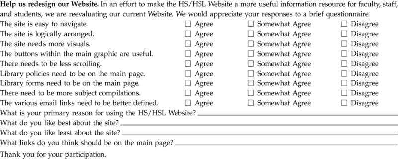
A Web-based survey (Appendix D) was posted on the existing HS/HSL Website as another step in the evaluation process. Participants were asked to either agree, somewhat agree, or disagree with nine statements. Four open-ended questions were designed to encourage users to provide specific information. An additional “comments” section was also provided.
The survey was posted for approximately one month, from mid-December 1999 through mid-January 2000. However, the response rate was statistically insignificant. The timing of the survey might have played a role in the low return rate, as it coincided with the end of a semester and a holiday break. The low response rate may also have indicated that people were not using the main page of the HS/HSL site but instead bookmarked specific pages relevant to their individual needs.
The limited number of received responses indicated that the site needed to have easier navigation, require less scrolling, and provide important links on the main page. They also indicated a need for a more logical organization of the material, links to a greater number of resources, and more and better visuals. These results from users served to reinforce the observations of the library's Web Redesign Committee.
Library division review of existing site
Staff members from the five divisions in the library were requested to review Web pages pertinent to their functions and to suggest any additions or changes they felt were necessary. They were also asked to review the organization of the information and offer suggestions for its improvement. Some of the divisions created subcommittees, while other divisions surveyed all staff for feedback. The resulting suggestions were then presented to the Web Redesign Committee for review.
REDESIGN AND DEVELOPMENT
Based on the results of the above assessments, two prototypes of a new HS/HSL Website were developed. One prototype featured a three-column design that included a center column with a graphic that introduced the library and two flanking columns that contained library information and library news. The second prototype presented a two-column design with a narrow left-hand column listing major categories. Each category, when selected, had a cascading menu listing topics within the category. The larger column contained a list of major resources and services. The three-column design was preferred by the committee, because it did not require scrolling and provided a better layout for the use of graphics in a “What's New” column. The second prototype updated the look of the page but was still heavily text based and required scrolling. However, the committee did like the main part of the page containing major categories of information. A third prototype was developed that incorporated the preferred features of the initial two designs.
The third prototype was a three-column design with a center column listing major categories of information and services. It also gave users the ability to link directly to heavily used sections of the site through a “Quick Links” column and to link to library news through a “What's New” column. The predominant teal color in all prototypes and the final design was used to be consistent with the color of the library logo. Color was also used on the tool bar at the top of lower-level pages to tie together the pages in each of the main categories. This provided consistency and predictability that would enhance usability [9]. The third prototype included the main page plus second level pages.
To enhance the visual impact of the site, the committee wanted to increase the use of graphics. However, it was important to avoid large graphics that would load slowly. As a general rule of thumb, no single page should include more than 200 kilobytes of graphics [10]. The library logo and other graphics on the HS/HSL home page total less than fifty kilobytes.
A second usability study was conducted in which participants were asked to perform the same tasks as the original study group did. The volunteers included three students, three staff members including one new library staff member, and one faculty member. The committee also invited the volunteers from the original usability study to return. From the original group, two faculty members and one staff member agreed to participate.
Based on the observers' notes, two features that volunteers found especially useful were the “Quick Links” option, providing direct access to the most frequently used information, and the pop-up menus, listing the contents of the major categories. The “Search Our Site” option was used as a last resort. Participants said they liked the site's look and its ease of use, the brief descriptions of the categories, the search box, and the minimal amount of scrolling required to locate information. However, there were still a few problems with terminology. Also, the graphic links at the top of the page were ignored.
Most encouraging to committee members was the fact that the prototype outperformed the existing site. Volunteers completed the tasks in a much shorter time period than during the first usability study. One volunteer in the second study completed all eight tasks in less than ten minutes, compared to an average of approximately twenty minutes required during the first study. The number of times volunteers needed to back up or return to the main page to select again was reduced by more than 50%.
However, volunteers still needed the terminology to be clearer and the graphics at the top of the page to be larger. These issues and others were addressed in a committee meeting. In both usability studies, problems with terminology had been noted. One major concern about the original site was the section entitled “Computer and Technology Services (CATS).” Participants were confused by headings, such as “CATS Instructions” or “Documentation,” used in this section, as they could not tell what was contained in these sections. For the prototype, the heading was changed to “Computing Accounts and Assistance,” and the second-level page category “Documentation” was changed to “Instructions.” This still proved confusing to users, because it did not clarify what type of accounts or computing assistance was provided. Following the two usability studies and subsequent discussion in a meeting, the committee decided to be more specific about the type of computing assistance offered through the library. The section is now called “UMnet Computing Assistance,” and the word “Instructions” replaced the term “Documentation.”
Other changes to the prototype involved design issues that were made following the approval of committee members. The graphics at the top of the page were enlarged to make them more visible. Pop-up menus were replaced by brief descriptions under the section headings on the main page, removing the need to use JavaScript. This change accommodated people with older browsers that do not have JavaScript capability or those who have turned off this feature.
Content enhancements made to the site included the addition of more library forms and policy statements, descriptions of each division and department in the library, provision of a campus map, and development of more lists of selected Websites by topic. A new section on education and training was added to highlight library classes, school-specific library orientation pages, and database instruction sheets. Access tools added to the site included a search engine permitting keyword searching and a site map.
An important issue in Website development is compliance with the Americans with Disabilities Act (ADA). The uniform resource locators (URLs) for the site were entered in Bobby, a free service provided by the Center for Applied Special Technology (CAST). Bobby helps Web page authors identify and repair significant barriers to access by individuals with disabilities [11]. The pages passed the test.
LAUNCHING THE NEW HEALTH SCIENCES AND HUMAN SERVICES LIBRARY WEBSITE
In May 2000, the new and improved HS/HSL Website (Figure 2) was launched. A link to a survey was included under “What's New” to give users an opportunity to offer their opinions of the new site. Comments were very positive. A few of our favorites included: “New site rocks!!!!!”; “Cool, looks very professional and I see additional information”; and “Site looks great and works well.”
Figure 2.
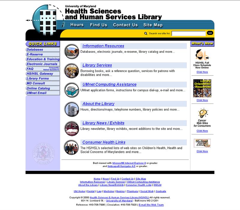
The library's new Website
CONCLUSION
The goal to create a site that would be functional and usable and provide the library with a more up-to-date image was achieved. The inclusion of the campus in the redesign process also led to higher visibility for the library. Staff members from the library were asked to serve on a review committee for the EnviRN Health site, being developed by the new Environmental Health Department at the School of Nursing. This committee discussed using the HS/HSL site as a model for creating their site. The library's Web manager has also been asked to serve on the campus's Web Advisory Committee and on the campus's Web Strategy Committee.
As with any project that involves technology, change is the only constant. New content is continuously added. Additional subject compilations of Websites are under development, and new digital resources are included as they become available.
A Website is an ongoing commitment. It has to be monitored and updated to stay current with the library's resources and services and with the rapidly changing world of the Internet [12]. Plans are underway to conduct another usability study to ensure that the site continues to serve the needs of its users. The site will be reorganized as needed. An initiative within the University of Maryland, Baltimore, to develop a campus portal will have a major impact on future plans.
APPENDIX A
Websites reviewed in late 1999 to early 2000
Medical/Health Sciences Libraries on the Web (http://www.lib.uiowa.edu/hardin-www/hslibs.html)
National Library of Medicine (http://www.nlm.nih.gov)
Thomas Jefferson University (jeffline.tju.edu)
University of Arizona (http://www.ahsl.arizona.edu)
University of Michigan (http://www.lib.umich.edu/taubman/)
University of North Carolina (http://www.hsl.unc.edu)
University of Southern California (http://www.usc.edu/hsc/nml/)
University of Washington (healthlinks.Washington.edu/hsl/)
APPENDIX B
Tasks performed during the usability study
Locate a form to request a photocopy of an article.
Find out when the next MEDLINE class is being offered.
Find out when the library has extended hours.
Determine what library services are available for the disabled.
Find the Statistics Resources Web page (it provides links to Websites containing statistics on a variety of topics).
Locate the instructions for connecting your home computer to the campus.
Locate the Collection Development Policy.
Find the ERIC database.
APPENDIX C
Questions asked after tasks were completed
What are your general impressions of the HS/HSL Website? What do you like? What do you dislike?
Did you find the Website easy to use? Why or why not? If not, what would make the site easier to use?
What information did you expect to find but did not?
What links are the most important and should appear on the main page?
Do you have any other comments?
APPENDIX D
Web-based survey
 |
APPENDIX E
Selected references for effective Web design
Andrew PG, Musser LR. Collaborative design of World Wide Web pages: a case study. Inform Technol Libr 1997 Mar;16(1):34–8.
Cunliffe D. Developing usable Websites—a review and model. Internet Res 2000;10(4):295–307.
Cunningham J. Ten ways to improve your Website: take time to dust off those Websites. C&RL News 1999 Sep;60(8):614–5,628.
Dickstein R, Mills V. Usability testing at the University of Arizona Library: how to let the users in on the design. Inform Technol Libr 2000 Sep;19(3):144–51.
DiNucci D. Yay, teamwork. Print 1999 May/Jun;53(3):26–9.
Guenther K. Evidence-based Web redesigns. Online 2000 Sep/Oct;24(5):67–72.
Nielsen J. Designing Web usability: the practice of simplicity. Indianapolis, IN: New Riders Publishing, 2000.
Nielsen J, Norman DA. Usability on the Web isn't a luxury. Inform Week 2000 Feb 14;773:65–70.
Ozok AA, Salvendy G. Measuring consistency of Web page design and its effects on performance and satisfaction. Ergonomics 2000 Apr;43(4):443–60.
Rindegard J. HTML is still key, but design skills and teamwork are also vital. InfoWorld 1999 Jun;21(26):69.
Tennant R. Digital libraries: user interface design: some guiding principles. Libr J 1999 Oct;124(17):28–9.
Footnotes
* Based on a poster presented at the 101st annual meeting of the Medical Library Association, Orlando, Florida; May 25–30, 2001.
REFERENCES
- Gullikson S, Blades R, Bragdon M, McKibbon S, Sparling M, and Toms EG. The impact of information architecture on academic Website usability. Electronic Libr. 2000 Oct; 17(5):293–304. [Google Scholar]
- Gullikson S, Blades R, Bragdon M, McKibbon S, Sparling M, and Toms EG. The impact of information architecture on academic Website usability. Electronic Libr. 2000 Oct; 17(5):293–304. [Google Scholar]
- Nielsen J. Ten good deeds in Web design. [Web document]. Fremont, CA: Nielsen Norman Group. [rev. 3 Oct 1999; cited 1 Nov 1999]. <http://www.useit.com/alertbox/991003.html>. [Google Scholar]
- Nielsen J. Top ten mistakes of Web design. [Web document]. Fremont, CA: Nielsen Norman Group. [rev. May 1996; cited 1 Nov 1999]. <http://www.useit.com/alertbox/9605.html>. [Google Scholar]
- Nielsen J. The top ten new mistakes of Web design. [Web document]. Fremont, CA: Nielsen Norman Group. [rev. 30 May 1998; cited 1 Nov 1999]. <http://www.useit.com/alertbox/990530.html>. [Google Scholar]
- Corry MD, Frick TW, Hansen L.. User-centered design and usability testing of a Website: an illustrative case study. Educ Tech Res. 1997;45(4):65–77. [Google Scholar]
- Head AJ. Web redemption and the promise of usability. Online. 1999 Nov/Dec; 23(6):20–32. [Google Scholar]
- Nielsen J. Why you only need to test with 5 users. [Web document]. Fremont, CA: Nielsen Norman Group. [cited 13 Mar 2001]. <http://www.useit.com/alertbox/20000319.html>. [Google Scholar]
- Nielsen J. Usability vs. the Web—reply. Commun ACM. 1999 Mar; 42(3):27–32. [Google Scholar]
- Goldsborough R. Net savvy: if going to design a Web site. RN. 1999 Jun; 62(6):21–2. [PubMed] [Google Scholar]
- Center for Applied Special Technology (CAST). Bobby. [Web document]. Peabody, MA: The Center. [cited 13 Mar 2001]. <http://www.cast.org/bobby/>. [Google Scholar]
- Clyde LA. Libraries and the Web. a strategic planning approach to Website management. Electronic Libr. 2000 Apr; 18(2):97–108. [Google Scholar]