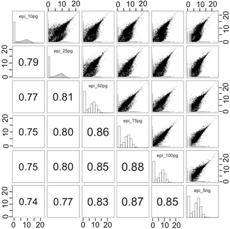
Fig. 4.

Scatter-plot matrix of the normalized counts after Log2 + 1 transformation for the 6 samples of the pilot experiment (RNA quantity from 5 ng to 10 pg). The scatter-plot matrix shows histograms of the variables in the diagonal. Each cell on the bottom of the diagonal contains Spearman’s correlation coefficient between the pair of variables indicated in the diagonal. Each cell on the top of the diagonal corresponds to the plot of the pair of variables indicated in the diagonal
