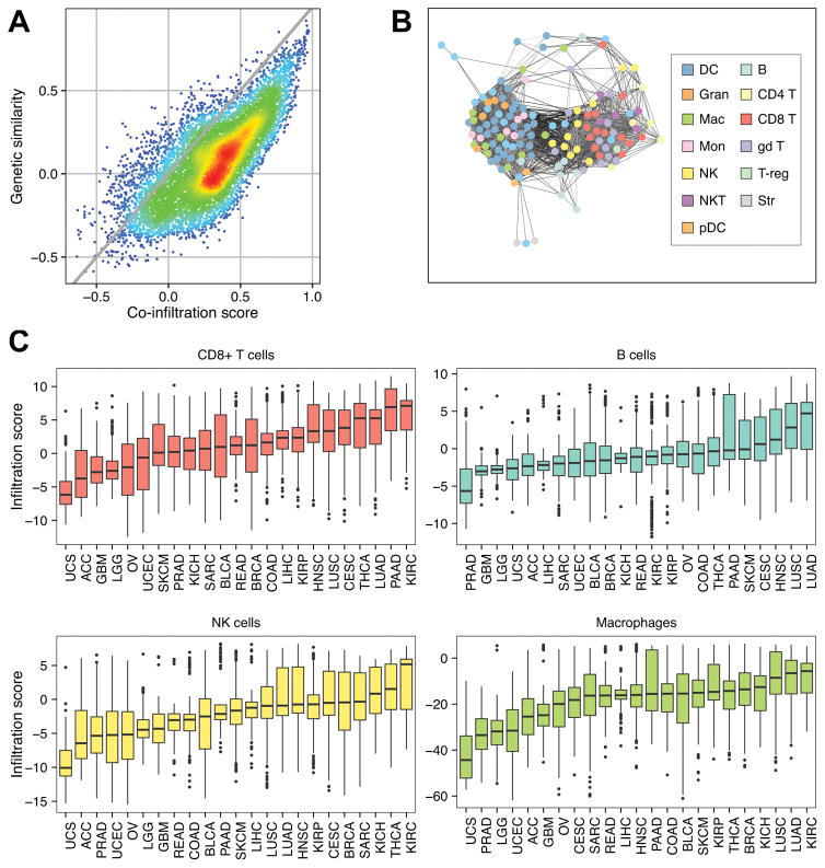
Figure 2.
Immune cell co-infiltration analyses. a Scatterplot comparing the pairwise infiltration score Spearman correlation coefficients from all possible immune cell combinations (co-infiltration score) to pairwise expression Spearman correlation coefficients from all possible immune cell combinations (genetic similarity score). Gray line represents the trend if the genetic similarity scores were equal to their corresponding co-infiltration scores (y = x). Warmer colors represent higher point density while cooler colors lower point density. b Co-infiltration network representing correlation structure between each reference immune cell. Nodes represent reference immune cells. Edges represent co-infiltration scores > 0.45. Darker edges represent lower transcriptional similarity between reference cell types. c Boxplots comparing the distributions of immune infiltration in four indicated immune cell subsets. Each box spans quartiles with the lines representing the median correlation coefficient for each group. Whiskers represent absolute range excluding outliers. All outliers were included in the plot. TCGA abbreviations for each cancer type are listed in Supplementary Table S1.

