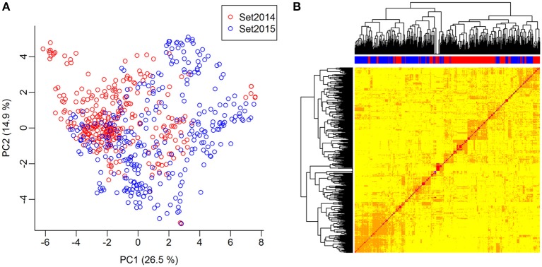
Figure 3.
Genomic relationship between lines. (A) Principal component analysis of the G-matrix for the 635 lines. Plot of principal components 1 and 2, which explain 26.9 and 14.6% of the variance, respectively. Lines from set2014 are displayed in red, while lines from set2015 are displayed in blue. (B) Heat map and dendrogram of G-matrix showing the relationship between the 635 lines based on the genotyped SNP markers. The bar on top of the heat map shows, which set the lines, are from: Red: Lines from set2014, blue: Lines from set2015.

