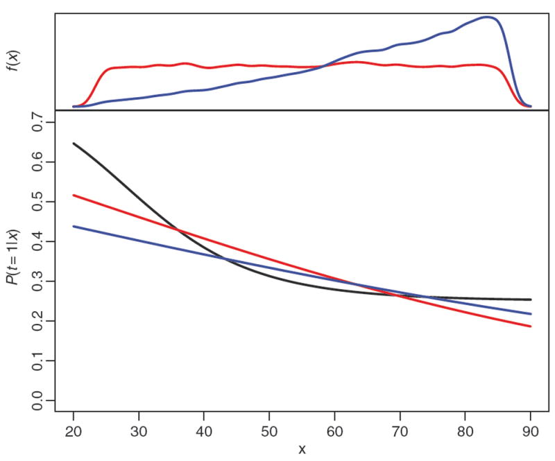
Figure 1.

Example propensity score models. The black curve traces the true treatment assignment probability. The red curve is the estimated propensity score without sampling weights. The blue curve is the propensity score estimated using the weights. The plot in the top margin shows the distribution of x in the sample (red and nearly uniform) and the distribution of x weighted to reflect the population (blue and increasing with x).
