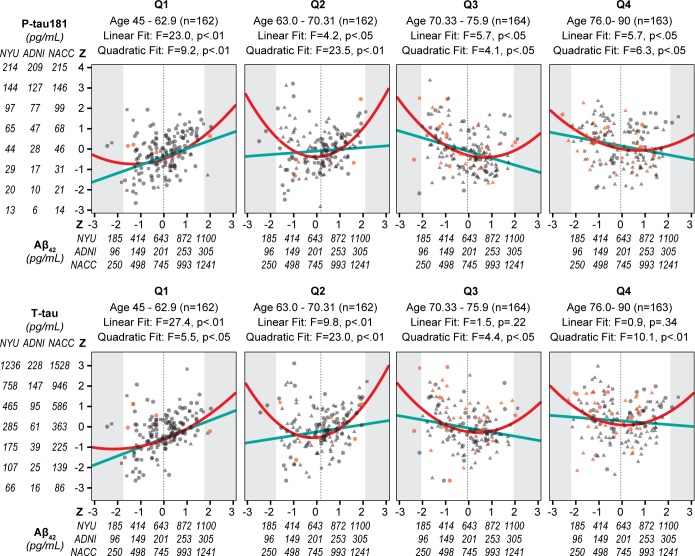
Fig 3. Relationship between age quartiles, Aβ42 and X-tau in 3 cohorts combined.
Scatter plots by age quartiles with the x-axis showing for Aβ42 the combined z scores and raw values by cohort. The y-axis shows the log transformed P-tau181 and T-tau raw scores by cohort and the combined z scores. Individual subjects are shown as circles for NYU, triangles for ADNI and squares for NACC. The outcome groups are indicated by color with the cross-sectional NL in blue, Stable NC in gray, and Future MCI/AD in orange. For each quartile, the linear fit is shown as a solid light blue line and the quadratic fit as a solid red line. The shaded area represents the area outside the 95% CI of the Aβ42 values for each quartile and the vertical dotted line is at the mean Aβ42 for each quartile.

