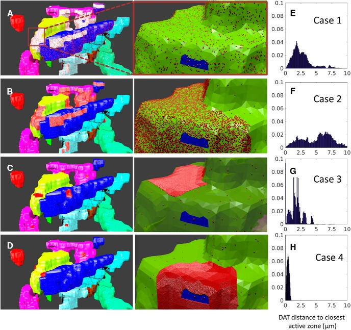
Figure 2.
Four space-dependent models of different plasma distributions of DATs. A–D, Distant (left) and magnified (right) view of the axon terminals in cases 1–4. Each color shows a different terminal, and the red dots represent the DATs. The white regions in A represent the regions with high fluorescence intensity, and those regions are filled with high density of DATs (red dots), magnified in B, where the blue region shows the AZ. The red patches in B–D illustrate high-density regions where ∼90% of DATs are clustered. E–H, Distance distribution of DATs to closest AZ center, from 140 independent simulations.

