
Figure 3.
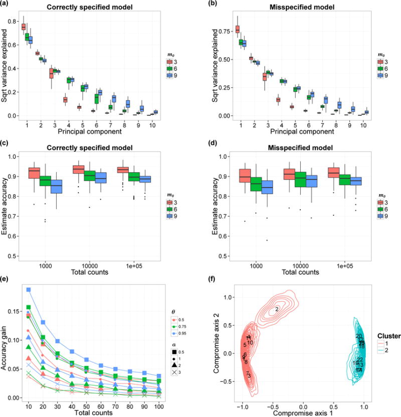
(a–b) Estimated proportion of variability captured by the first 10 PCs. Each box-plot here shows the variability of the estimated proportion across 50 simulation replicates. We show the results when the data are generated from the prior (Panel a) and from the model in (13) with a = 1 (Panel b). (c–d) Accuracy of the correlation matrix estimates The box-plots show the variability of the accuracy in 50 simulation replicates, with data generated from the prior (Panel c) and from model (13) with a = 1 (Panel d). We vary the true number of factors m0 (colors) and nj and show the corresponding accuracy variations. (e) Comparison between Bayesian estimates of the underlying microbial distributions Pj and the empirical estimates. We consider the average total variation difference, averaging across all J biological samples. Each curve shows the relationship between nj and average accuracy gain. We set m0 = 3 and the parameter a varies from 0.5 to 3 (shapes). The similarity parameter θ is equal to 0.5, 0.75 or 0.95 (colors). (f) PCoA plot with confidence regions. We visualize the confidence regions using the method in Section 4. Each contour illustrates the uncertainty of a single biological sample’s position. Colors indicate cluster membership and annotated numbers are biological samples’ IDs.