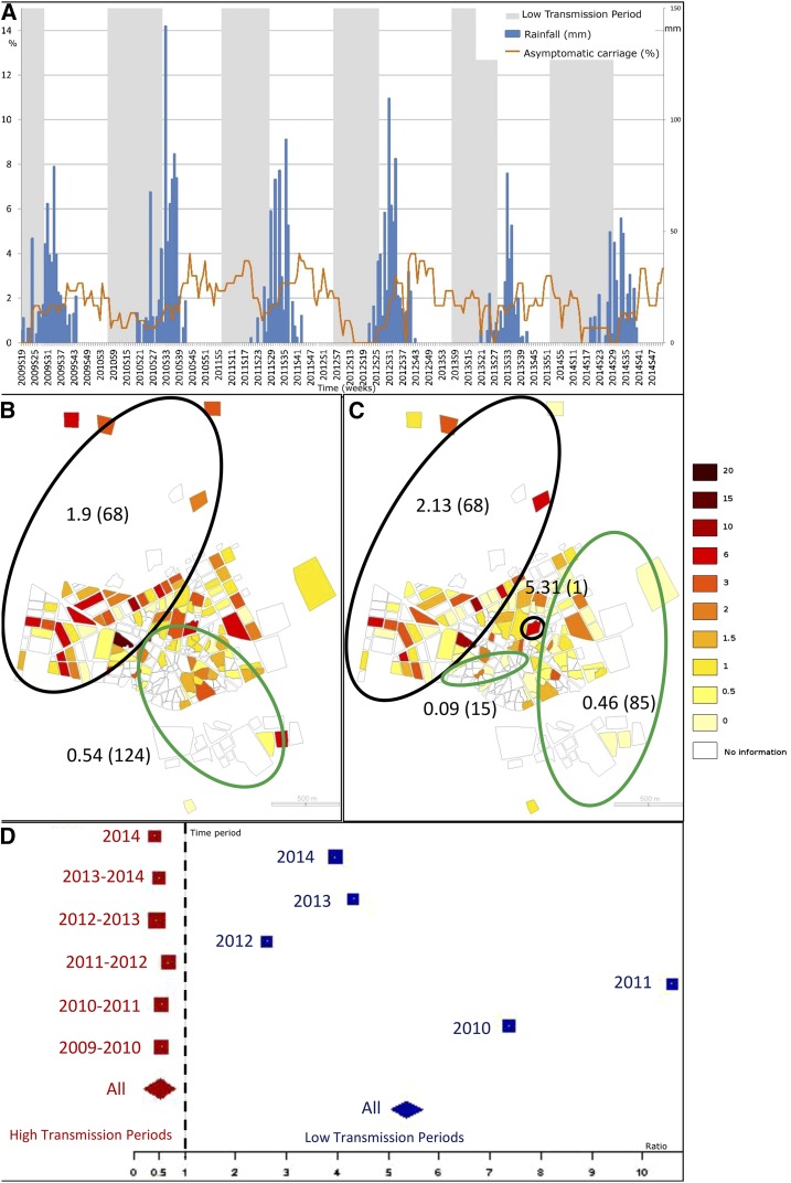
Figure 2.
Spatial and temporal pattern of asymptomatic carriage. (A) represents the weekly time series of asymptomatic carriage incidence per 100 children (orange). Weekly rainfall is presented in blue. Low and high transmission periods are presented, respectively, in grey and white. Choropleth maps of asymptomatic incidences, (B and C), are presented at the neighborhood level, respectively, for high and low transmission periods (through 2009–2014). Green ellipses represent low risk clusters (according to Kulldorff’s definition) and black ones, high risk clusters. Estimated relative risks of each cluster are presented (as well as the number of neighborhoods within each cluster, between brackets). (D) represents the asymptomatic carriage ratios by clinical cases for each high and low transmission period (red and blue, respectively). Each square is proportional to each period length. The diamonds represent the ratios for the high and low transmission periods (red and blue, respectively). This figure appears in color at www.ajtmh.org.

