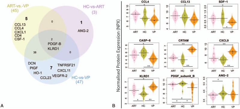
Figure 2.

Level of plasma soluble factor. (A) Venn diagram of plasma soluble factors statistically difference (P < .05) of the NPX value in a case–control manner. The sum of the numbers in each large circle represents the total number of statistically different proteins among various combinations (ART vs HC, HC vs VP and ART vs VP). The overlapping part of the circles represents common proteins between combinations. (B) Bean plot is indicating the level of the selected soluble factor. P < .05 is marked with “∗” while P < .001 with “∗∗.” ART = antiretroviral therapy, HC = healthy control, VP = viremic progressors.
