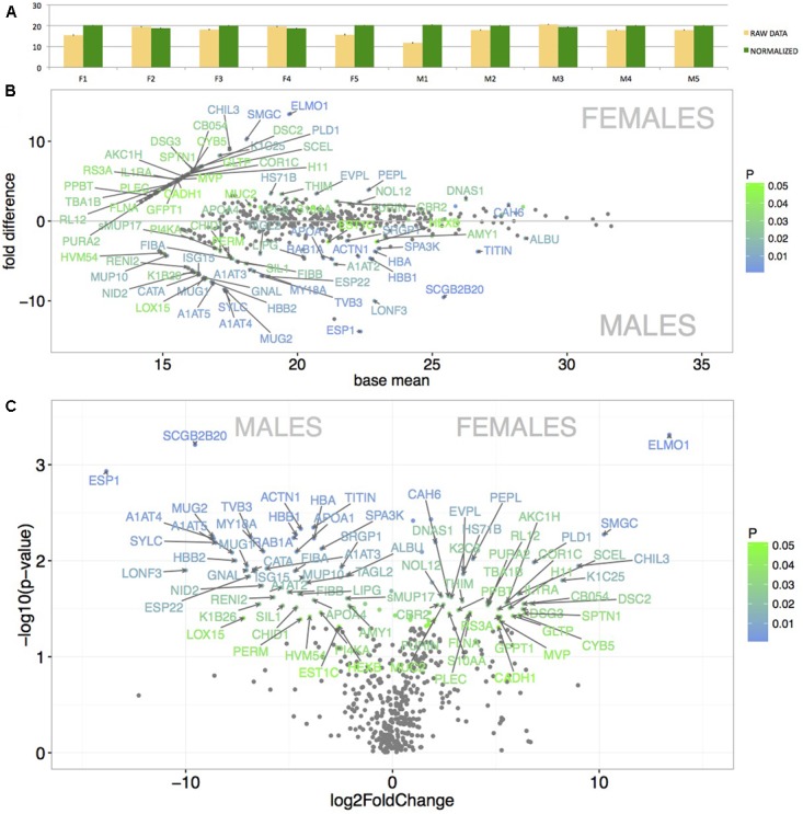
FIGURE 3.

Graphical representation of the mean protein signal intensities from LC-MS/MS (X-axis) and of particular fold differences between males and females. Before normalization, the data revealed some variation between individuals (A – yellow bars). However, after the quantile-normalization procedure (A – green bars), the mean value and SE bars show almost no variation between the samples. Significant differentially expressed proteins are demonstrated with MA plots (B). PLGEM model was involved in testing the differences in normalized signal intensities between males and females (B). The level of significance (males vs. females) is scaled from green (p < 0.05) to blue (p < 0.01) and only the data points with FC > 2 are annotated with protein names. The X-axis represents the basal mean of signal intensities in (B). The dependence of particular fold changes on p-values is provided using the volcano plots in (C).
